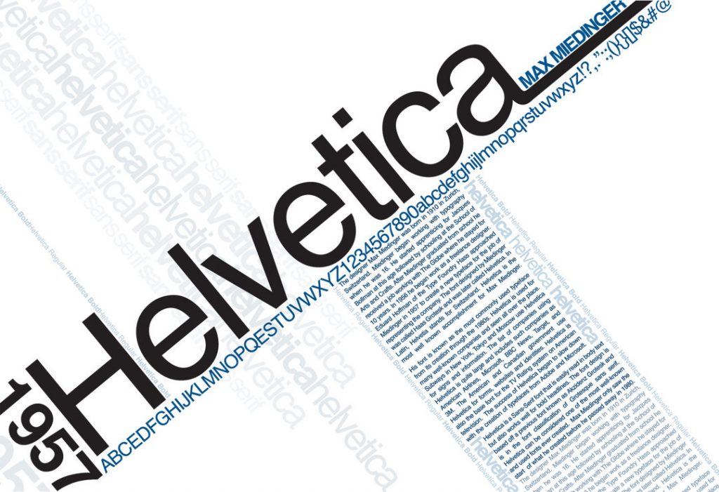
The Godfather of Fonts
‘The Godfather of Fonts’. It’s a snappy title, don’t you think, though I wonder whether Mike Parker, who died in February this year, liked the moniker.
You probably encounter Parker’s work fifty times a day: he was the man who adapted and promulgated the font that became known as Helvetica.

The typeface with its unfussy lines became ubiquitous in the latter half of the twentieth century, picked up in the public signage and logos for a raft of companies and institutions, a similar font would become the one used by British Rail and the NHS.
It’s funny though, while reading Parker’s obituary in The Telegraph, I was interested to read that while Helvetica became the font of choice in the public sphere, ‘it never really took off on the printed page, research showing that serif typefaces are easier for users to read in book-length stretches of text.’ It seems counter-intuitive doesn’t it, you’d think that the clean lines of sans-serif text would be absorbed more easily by our eyes and brains. But then fancifully, I couldn’t help but daydream that the little notches and flourishes of a Baskerville or Garamond help ‘hook’ our eyes on the text, and stop them sliding uncontrollably over the page or screen.
If this post has been of interest, I’d highly recommend Simon Garfield’s Just My Type for a very interesting outline of the history and development of many day-to-day typefaces.
Lesley Crooks, Digital & Online Marketing Manager


