Fonts in the flesh
As you might expect in an office filled with bookish types, we’re partial to a good font at A&B.
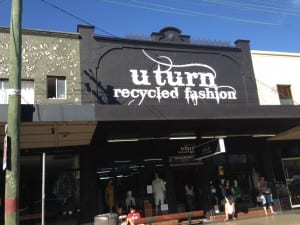
In fact, spotting the ‘Morganville Vampires’ font has become something of an office game, with our former colleague Chiara the current champion with most far-flung points. The picture below was taken a suburb Sydney.
![]()
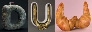
But I recently spotted a font in a Wired article, a CGI 3D sculpted set of letters, that definitely wins the prize for most eye-catching. The designers behind it are based in Germany and called FOREAL. There is a moonrock ‘D’, a molten gold ‘U’ and a rather tasty looking croissant ‘W’ as you can see below.
but I can’t help but me simultaneously drawn and repulsed by some of the more…fleshy examples.
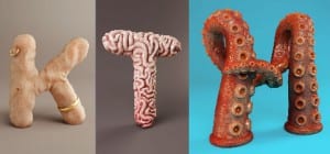
It’s a whole new level to deciding between serif and sans-serif. See more of their sculpted alphabet here.
Lesley Crooks, Digital & Online Marketing Manager

