Wednesday (um, Thursday) Cover Story: Every little detail counts
I have just returned from a ten-day break in sunny Madrid. So if you were wondering what had happened to our Wednesday Cover Story yesterday, well, it was having a nice siesta by the pool.
However, as I caught up with emails and tweets today, I spotted a tweet from @paddyhoey which has given me a reason to talk about covers today…
We’ve had many compliments about the new cover designs for Adrian Magson‘s latest releases in his Lucas Rocco series, Death on the Point Noir and Death on the Clos to Lac. My personal favourite is Death on the Pont Noir (love the colours and the grainy look giving it a noirish feel) and those that have voiced their praise too have commented on colouring, the addition of Rocco’s silhouette or the overall design in a general way. But when @paddyhoey complimented the cover, he picked in his praise something arguably less obvious and much more specific.
“The covers are very beautiful. I love the capped serifs of the type face on the last two.”
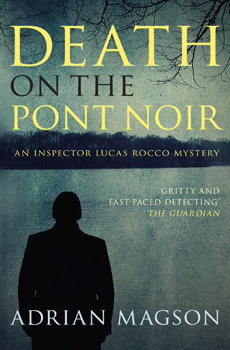
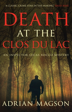
Of all things, I, personally, would not picked the typeface as the main draw, and I must admit I had to check the covers again to confirm what kind of serif the font was. I love the fact this reader honed in on a small detail of the typeface. It goes to show how covers ‘speak’ to readers in so many different ways – different elements standing out to different people. And shows that nothing on a book cover can be dismissed as unimportant.
Chiara Priorelli, Publicity & Online Marketing manager

