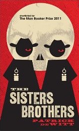
Wednesday Cover Story: When more is more
I was making a list over the past few weeks of books I’d seen in The Bookseller or around town that I might want to stock up on for holiday reading. Of course, when I actually went into Waterstone’s I managed to completely ignore said list and was lured up, down, and side to side through the store by the many, many pretty books calling to me from the shelves.
One book that had made it to the list, surprised me in the flesh…
The Sisters Brothers has a cool, pared down illustration as you can see, but that didn’t sell it for me. What you need to appreciate, oh-lovers-of-beautiful-books, is that this book glows on the shelf. I’ve never seen a cover like it before. Unlike the kind of foiling incorporated into many book designs, where the foil is an accent picking out title, author name, and elements in the cover images, this looks as if the entire book were foiled. The word ‘burnished’ comes to mind but if anyone knows the correct term, do share.
It did the job (i.e. made me pick it up and then part with my cash), and now just have to hope the contents make me as rhapsodical as the cover.
Lesley-Anne Crooks, Sales & Digital Manager


