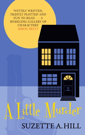
Wednesday Cover Story: The thought-process behind the cover to A Little Murder
Sometimes, after reading a book or manuscript, I can conjure up my own ideas of what could go (or could have gone) on the cover. And then there are other times where I wouldn’t know where to start. This, of course, is why our cover designs are left to our talented Art Editor, Christina…
A good example of a book that would have stumped me is A Little Murder, by Suzette A. Hill. Fellow author and Guardian crime reviewer, Laura Wilson, aptly describes the new novel as ‘a perfect mixture of funny and acerbic, with a cast of colourful characters and a school of well-deployed red herrings…wholly delightful.‘ And indeed it is. But how do you capture this on a cover – mystery and humour, crime and a bit of fun, all rolled into one?
Well, here’s how…
In order to reveal the thought-process behind the design, here’s what Christina had to say about it:
The cover is ‘two tone’ and features the shadow of the murder weapon in order to maintain a vague sense of stylistic continuity with Suzette A Hill’s previous Francis Oughterard mystery series whilst still creating a new look. As the book’s cast of characters is quite large I felt there would be no point in randomly choosing one or two for the cover and opted to represent the murder location instead, something I imagine would be also an easier constant to maintain in future books across the series. The retro typeface points to the action taking place in the 50s. The full moon was a late addition as a device to make the lovely quote from Simon Brett more prominent but actually works quite well in the context of the image.
So that’s how you do it, people.
Chiara Priorelli, Publicity & Online Marketing Manager


