Wednesday Cover Story: One Book, Two Looks
Recently I was lucky enough to receive a copy of R.J. Palacio’s Wonder, courtesy of a lovely friend at Random House, its publishers. I’m looking forward to reading this, which has had great success and brilliant reviews – in case you haven’t heard of it, it’s the frank, moving, and (I hear) sometimes funny story of a boy born with a facial abormality, just trying to fit in. Technically it’s a children’s book, but that’s never stopped me.
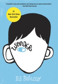
What intrigued me before I’ve even read the first line, however, are the very different cover versions of the book. The cover most will recognise is the following distinctive design, which I think works brilliantly:

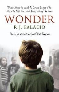
The copy I managed to snag, however, conveys something different with it’s photographic look:
I think the first is more eye-catching, conveys that it’s a children’s book, and is generally much more iconic. But it’s interesting to see the way two designers will come up with two totally different responses to one book. Have you ever noticed a book with two contrasting cover designs? And which one do you think works best?
Sara Magness, Editorial Administrator


