Wednesday Cover Story: Narcopolis, by Jeet Thayil
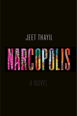
Yesterday I tweeted the link to 10 books featured on Flavorwire. They were highlighted as must-reads for April, but to me, they were mostly interesting because of their original covers. And one cover in particular stood out the most for me: Narcopolis, by Jeet Thayil.
This is the hardback American edition (very different to the UK edition, whose cover, on the other hand, doesn’t appeal to me at all). The stark contrast between the vibrant colours used for the title and the black foreground is extremely effective. Given the book is said to be about ‘the beautiful and damned residents of an opium den and brothel in Bombay’, this juxtaposition seems to fit perfectly with the content of the novel, where the dark world of prostitution, drugs and death blends with opium-induced psychodelic bliss, and the beauty and colours of India.
Moreover this contrast creates an almost 3D effect. It makes you want to find out what’s behind that black exterior…I want to somehow dive into the lettering into the multi-coloured world on the other side. (In fact I’m curious to see that colourful image in full). I also want to know whether the designer used that idea to the max. The letters of the title could be cut out of the black dust-jacket (that wraps about the actual hardback book) and the coloured background you see through the cut-out lettering could be printed on the actual board of the hardback. Is that the case? Is there any one that can answer that for me?
Chiara Priorelli, Publicity & Online Marketing Manager


