Wednesday Cover Story: A cover that mirrors the content
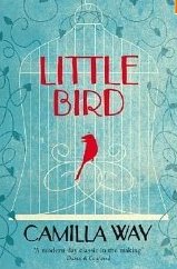
I am in the process of culling the number of books in my house as a cathartic (and sensible) clearout before moving flat. And amongst my sagging bookshelves I found a copy of Little Bird, by Camilla Way – which I remember picking up many years ago when HarperCollins was having their own clearout of the office. And I picked it up solely on the basis of the cover which I adore and hence has been sitting on my shelf ever since.
The two-dimensional illustration is so simple yet so effective. That bright red bird so small, yet so eye-catching against the blue background. And somehow (perhaps it’s this sharp contrast, or the textured, darkened background) it has an eerie feel to it. The idea for the cover could have come across as sweet and dainty, and yet the final package manages to hold a hint of something else…intrigue? foreboding?
I never actually read the book until now (figured it was high time I stop just admiring the cover and delved into its contents) and am currently halfway through. I can say this: it is a cover that perfectly captures the tone of the novel – not always the case, as many book cover designs, whilst being clever or striking or marketable, don’t always truly reflect the essence of the book tbey are packaging.
Chiara Priorelli, Publicity & Online Marketing Manager


