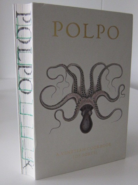
Wednesday Cover Story: How good is that book spine?
Yesterday I attended the Bookseller’s Marketing & Publicity Conference which featured a wide range of interesting speakers covering topics from creative campaigns, discoverability, the Amazon algorithm, Facebook and Goodreads, and more. Steve Bohme, from Bowker discussed market research and revealed rather suprisingly that customers, when browsing in a bookshop, primarily browse books on shelves (as opposed to on display tables) where, for the most part, all they see is book spines. So, whilst we all know how much importance is placed on the cover of a book, it goes to show how much attention should be placed on book spines too. Plus, it all adds to the final package as a whole.
At Emily Winslow’s recent event at Heffers, I happened across a copy of The Shadow of Death, by Sidney Chambers – part of the Grantchester Mysteries, a series that begins in the 1950s. I don’t have an image of the actual book to show you, but the spine of these novels (including the paperbacks) have been given a design that mirrors the spine of old-fashioned books (such as that pictured below) divided into different “sections” by horizontal lines. It immediately tells the reader that there is a period element to these novels. It also subliminally suggests an added sense of quality. Yes, reader, do pick me up and place me next to your old limited edition classic on your bookshelf….
We’ve showcased the remarkably inventive spine of the book Farenheight 451 in a previous blog, and yesterday at the conference the cookbook Polpo, by Russell Norman was highlighted for its packaging (it won an award for its design) which includes an extremely innovative spine…in that it doesn’t actually have one.
The spine has been removed so the book sits perfectly flat on the counter when you open it up – a wonderfully practical design feature. The spineless element certainly makes the book stand out amidst other book spines on a shelf, with the words POLPO merely printed on the ends of the actual pages. I also learned that the colour of the stitching on the spine denotes the printing edition of the book.
In conclusion, whether you decide to give a book a strong backbone, or indeed to make it spineless, the important thing is not to ignore the spine’s importance.
Chiara Priorelli, Publicity & Marketing Manager


