Wednesday Cover Story: Not so elementary a font, my dear Watson
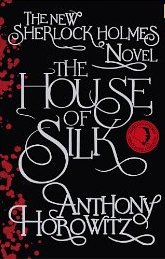
The release of the new official Sherlock Holmes novel, The House of Silk, by Antony Horowitz has many people questioning if it will measure up to the great Sir Arthur Conan Doyle. But, seeing as I already get my fill of Holmesian escapades with Laurie R King‘s fabulous Mary Russell & Sherlock Holmes series, the only real question I have with regards to Horowitz’s book is: What font did they use on the cover?
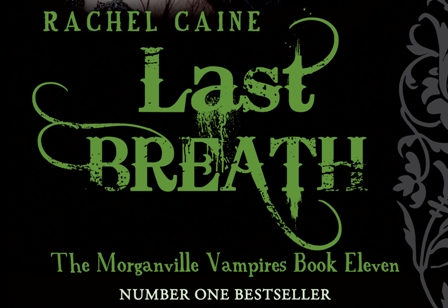
It’s a beautiful font, and deservedly takes over the entire design – with no images to distract from the swirling beauty of the letters. It reminded me a little of the font we used on Rachel Caine’s Morganville Vampire series (eg. see the text on the cover to Last Breath below) but obviously it’s different.
Anyway, it’s a gorgeous font and deserves a mention here. And whilst I could undergo a little Holmesian investigation of my own to find out what font was used…if anyone can easily satisfy my curiosity and tell me the name, I’ll thank you in advance!
Chiara Priorelli, Publicity & Online Marketing Manager


