Wednesday Cover Story: The four covers to Under the Dome
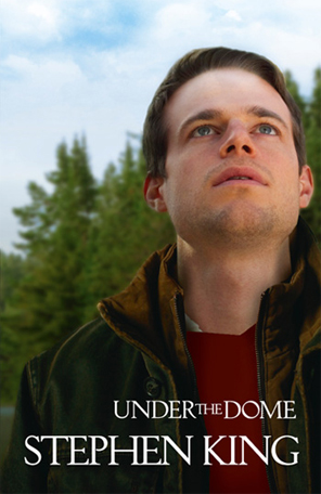
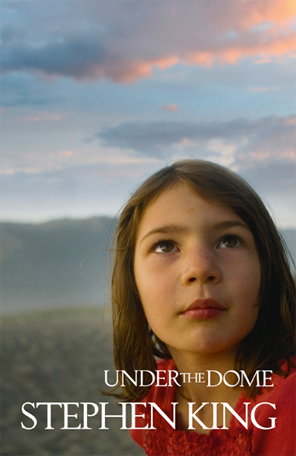
These are the four different covers to the book Under the Dome, by Stephen King – depicting each of the four main characters in the book.
As book covers go, these covers do look odd, with the title and author name pushed to the bottom of the image, almost as though the designer wished he didn’t have to include it at all. There are no quotes or straplines as per the norm – leaving the close up image of the character as clean and as uninterrupted by text as possible.
And there’s the brilliance of it. Yes, it does look odd. It doesn’t look right. I find I’m not comfortable with this look as a book cover… and surely that’s perfect for a Stephen King book – an uneasy read, involving something out-of-the-norm.
Moreover, this complete focus on each characters immediately tells the reader that the focus of the book will be these four characters – their unique story, their perspective. And with each close-up you can’t help but notice they are all looking up at the same point (one can assume the Dome), subtley highlighting their common ground and adding to the intrigue – what is this Dome they are looking at?
Moreover the four “character” covers are an interesting concept for marketing the book. Which character are you most interested in – the old man, the child, the young woman, the young man? If you bought the book, which cover would you choose? It invites us to think about it, engaging us even before we’ve even thought about reading or buying the book!
Which, in fact, would you choose? (I’d probably go with the young woman, being a young woman myself, or the child, as I actually find that image quite beautiful.)
Chiara Priorelli, Publicity and Online Marketing Manager
Want to flag up a cover for our Wednesday Cover Story? Write to chiara@allisonandbusby.com with your thoughts
2 thoughts on “Wednesday Cover Story: The four covers to Under the Dome”
Leave a Reply
You must be logged in to post a comment.


What a great idea! Personally, I like the old man image most – or rather, it unnerves me the most. The colours are more dramatic than the others and he seems the most vulnerable for some reason.
Um…I’ve just realised it’s Thursday today! Bank holidays alwasy put me out of whack…Let’s call this the THURSDAY COVER STORY!!